Discover the top 10 SEO benefits of responsive web design and unlock the potential to enhance user experience, boost search engine rankings, and drive more organic traffic to your website. More than half of all consumers use mobile phones nowadays, therefore having an adaptable website is now a must rather than a choice.
It’s becoming more and more crucial to have responsive web design to make sure websites are mobile, desktop, and laptop optimized.
We’ll talk about responsive web design in this blog and why it’s more important than ever for websites. In addition, we will discuss the advantages of responsive design and offer best practices for creating websites that are responsive.
What is responsive design?
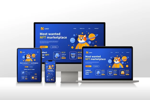
Making web pages that display properly on a range of devices and screen sizes is known as responsive web design, or RWD.
Web designers may then develop a website experience that adapts to the various ways users visit and engage with websites.

About sixty percent of all web traffic is generated by mobile devices worldwide.
Therefore, it is imperative that website owners provide accessible and user-friendly websites, especially on small screens (such those found on tablets and smartphones).
Top 10 SEO Benefits Of Responsive Web Design
Despite a wealth of published evidence demonstrating that responsive web design improves user experience, many website owners have been hesitant to use responsive web design.
These are a few of the main arguments for why it ought to be very important to you.
1. Enhanced User Experience
Enhancing user experience is one of responsive design’s main advantages. A adaptable website will adapt to the screen size and orientation of any device, giving consumers the best possible viewing experience. This makes it possible to navigate and interact with the website easily on any device.
2. Improved Usability
Time on Page is a useful metric to determine whether users have found what they’re looking for and whether they’ve had a good experience with your website.
The idea is that users are unlikely to stick around if they are not satisfied with your content, or in this case, your online experience.
Websites with responsive web design load quicker, are easier to use, and are more navigable.
It often encourages users to stay on your site longer and makes it easier for them to find the content they are looking for.
Outstanding usability might also entice visitors to return to your website in the future.
Additionally, people are not only spending more time on your website, but they are also significantly more
3. Better Search Engine Rankings
Enhancing SEO rankings is one of the responsive web design’s many important advantages. Websites with responsive design provide a consistent user experience across all devices, which is something that search engines value highly. Your website can gain greater online visibility and traffic by raising its SEO ranking.
4. Increased Reach
You may reach a wider audience with a responsive website, regardless of the device they use to see it. This implies that customers will be able to view your content on any screen size, improving user experience and ultimately increasing brand engagement.
5. Improved Page Speed
Another important component that has a big impact on your SEO and search engine results is page speed.
A user’s experience on your website may be positively or negatively impacted by how quickly it loads.
Therefore, it should come as no surprise that your website needs to be optimized for fast, error-free loading.
6. Simpler Maintenance
Because it eliminates the need to maintain separate versions of the site for various devices, responsive design facilitates easier website maintenance. You can avoid the hassles of maintaining multiple websites and save time and money by making changes to just one.
7. Better Analytics
You can monitor a website’s performance on all devices with a responsive website. As a result, you can gather and examine data from various platforms, screen sizes, and orientations to gain insightful knowledge about user behavior. You may enhance user experience and increase conversions by using statistics to inform data-driven decisions about how visitors engage with your website.
8. cost-effective
The affordability of responsive web design is another significant benefit. With a responsive design, you can manage a single website that adjusts to all displays instead of having to build and manage several versions of the site for different devices. This is a smart investment for any company or organization since it not only saves costs but also time and effort.
9. Increased Rates of Conversion
Conversion rates can be greatly increased with responsive site design as well. A website’s chances of generating greater engagement and purchases from users who see it optimized for all devices are enhanced. Having a website that is sensitive to the demands of customers can be crucial in the modern digital market, when consumers are more discriminating than ever.
10. Extended Proof
One innovative strategy that can help future-proof your website is responsive design. Responsive design makes sure that your website is usable and accessible for people on a variety of devices and screen sizes, so it won’t break down when new technologies are added in the future. This guarantees that, in the ever-changing digital landscape, your website stays competitive and relevant.
Guidelines for Optimum Responsive Design
One of the most important aspects of modern web design is making a website that’s functional and displays excellent on many devices. In light of this, let’s examine some responsive design best practices that will enable you to provide a flawless user experience.
- Go from inches and pixels to grids.
- For layout adjustments dependent on screen size, use media queries.
- For quicker loading times, optimize your images.
- To make sure your website is mobile-friendly, take a mobile-first perspective.
- In order to make sure that text is readable on all devices, use responsive typography.
- Try your website across different kinds of screens and devices.
- To accelerate development, use a responsive framework.
- Instead of using raster images, use scalable vector graphics (SVGs).
- To provide the best user experience, take into account where elements are placed on the page.
- Make use of a grid structure that is adaptable to various screen sizes.
If the success stories of flexible websites aren’t enough to persuade you to switch to this style of design, then perhaps the financial and scheduling benefits will. Any modern web strategy should include responsive design as it is an essential component.
If you’re prepared to make the investment in a responsive website, get in touch with us for a free, fully tailored quote to make your website responsive!

